The Creation of a Project for a Commercial Space, Part 2

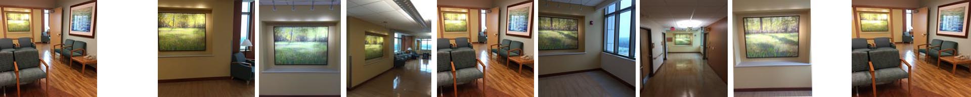
Here is an update on a painting in progress, a gallery commission for a new restaurant being built in South Carolina.

Client to decorator to gallery to artist is the flow of communication, coordinating to work out the details on a project like this. The size for the painting couldn't be decided until more of the wall and window trim work had been installed, but we finally got the decision: it needed to be 55” x 55”. Being a custom size, I had to special order the canvas from a supplier in Houston, TX, who shipped it via freight. Sixteen days later, the canvas was uncrated and placed on my wall easel.

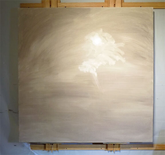
So what's next? How do I begin such a large painting? I am no longer intimidated by a giant-sized blank canvas, and I really love starting large paintings with large paintbrushes and big arm movements. I toned the canvas with my favorite underpainting color: thinned Raw Umber. An underpainting helps me establish some of the future values and gets rid of bright white canvas that might otherwise peek through later stages. While this was wet, I used a small rag to wipe out the lightest light: the sun and its surrounding area (first photo). I allowed it to dry two days. In this way, when drawing/placing the trees, I could wipe off to make changes without disturbing the underpainting.

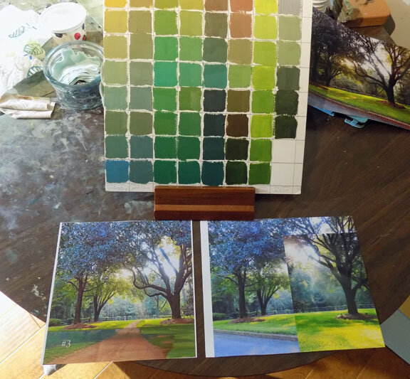
The second step was to examine my reference photos, which I'd already printed out. I got out my color chart of different recipes for green (second photo) and decided which main colors I was going to use: in this case, Phthalo Blue and Yellow Ochre will give me a range of greens from warm to cool. I will also use some Sap Green mixed with Raw Umber for the warmer dark greens and a little Cadmium Lemon Yellow mixed in for the lightest leaves and grass. Tints and shades made from Burnt Sienna mixtures will later create the red dirt road and hints of warm sunbeams streaming through the branches.

If you look at my reference photos, which are not that great, you will see they are heavily Photoshopped. I've added the road and flipped the tree on the right around to give it a better shape! I do stuff like this all time, taking great liberties with what was really there.

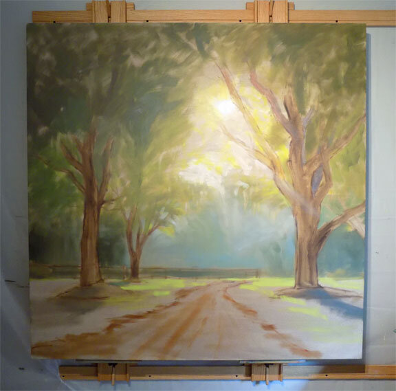
The next stage of the painting (third photo) was to “draw” the trees on the canvas with thinned paint. This was mentally tiring, but I enjoyed it. I don't use a projector or grid lines, I just hold up my photo to sight size to place the lines in approximately the right spot on the canvas. Trees have gestures and I took my time getting all the twists and angles drawn, though I left out some of the branches I thought were distracting. Then I drew, with paint, the horizon line, thinly blocked in the trees, a few shadows, and the tree canopy. I also used a straight edge to place fencing in the background. I laid out the road and finished by starting with the background color, one of my blue/ochre mixes. I love how it's looking already! I'll let this dry a few days before starting with the thicker paint.


The Creation of a Project for a Commercial Space

I have a lot of work to do. I should be painting right now! I’ve just gotten back from an out-of-state trip for an upcoming project and thought I’d share a little of the process. From someone’s initial request, how does the artist get the ball rolling with all the decisions to be made?

I was contacted by my gallery who has clients opening a new restaurant. They’ve actually bought my work in the past and were interested in a large painting of light-filled trees as the centerpiece over the site’s fireplace. I was already planning a trip to the coast, so what’s another few hundred miles to go meet with them—I agreed. I met the owners and their decorator on site, took notes of what they had in mind and photographed the setting, measuring the fireplace width. Then I followed the owner to the location of the trees they wanted in the painting. More notes. I also photographed an idea they liked from a book with a red dirt road, which turned out to be useful later on. I came back in the evening when the light was streaming through the trees to my satisfaction and made the rounds of the area with my camera. I think of these as Light Safaris because I’m trying to be in the right place at the right time to capture the elusive lighting I want in my paintings. I came back early the next morning and did the same thing before heading home.

The gallery had already discussed framing, pricing and sizes in preparation for a contract. My note taking mostly consisted of what they wanted as far as subject matter. Once home, my first step, as always after a photo expedition to a new place, was to look through my raw photos, making a note of which images would work for the project. Next, after waiting a day, I went back to those photos and looked more closely, opening them in Photoshop to begin cropping, resizing, adjusting lighting and color, and placing elements I’ve clipped from other photos. As an example, I actually cropped a section of the red dirt road from the photo I took of the book and pasted it into my photos in a grassy area with the right trees, and it looks amazingly good, though I hadn’t planned on doing this. I saved all these edited photos in a folder for the project, then looked at them the next day, selecting those I thought would look best in the space. I also prepped the image I’d taken of the fireplace in the room of the restaurant where the painting will hang and then pasted each of the painting ideas, to scale, onto the fireplace to show what it would look like in situ. This should give everyone involved in the selection a good idea of the finished piece. Then, I emailed all the photos to the gallery to pass on to the decorator and owners. I will keep you posted on the project.

Chapter Three: A Big Giant Mistake


I got the contract emailed, the art consultants paid me to get started, and I began happily painting away. No, it's never that simple, is it? My car at the time could only accommodate ONE 48x60 canvas at a time, so my husband, who has an extra large truck bed, had to drive me to the art supply store to buy the two canvasses. I really enjoyed the initial stage of painting. As you can see in the photo below, my favorite method to work involves toning the canvas and then wiping away the light areas with rags. This places all the shapes, establishes the value range and light source and creates interesting, exciting little marks and suggestions of foliage. After this initial stage, it's as if everything is in there and I just have to pull it out.

After many hours, starting with the background and working forward into the hundreds or thousands of blades of grass, it was check in time. Per our contract, I was to send a photo of the project at the halfway point. Imagine my absolute horror when I received the following email from the art consultant: "Rani, it looks beautiful, but you do realize it's supposed to be horizontal?" What? Let me read that again! And slowly it dawned on me: I had just assumed that, since they had based this commission on my vertically-oriented diptych, this would just be a larger version of it. I had not read the fine print in the contract due to being in such a hurry to get it signed and returned, and it clearly stated two horizontal 48x60s.  

project in progress. Notice the VERTICAL orientation!

project in progress. Notice the VERTICAL orientation!

Well with no time to waste, I grieved for about a minute and then moved my Big Giant Mistake Diptych to an unused bedroom with the other unsold 48x60s (yes, there are others!). Had to go buy two new canvasses.  But wait! My local store only has two, and one of them is damaged! Had to hunt some down online...I live in a rural area and had I not been able to find two that large, I would have had to get them in Atlanta with another day used up. My sweet husband and his big truck drove me down to a store in Albany Georgia which had what I needed. I painted my hands off: it was difficult having to paint individual blades of grass several feet tall on such a large painting. I painted the edge of a metal yardstick and pressed it onto the painting to make the stems of the weeds straight...and there was twice as much grass to paint now because of the horizontal orientation. But I finished in time! We drove down to the new, vast hospital complex and met up with the art consultants who were on their last day of hanging the artwork. Though a diptych, the two paintings were going to be hung in their own niches separated by a section of wall. It was very gratifying to be present while they were hung and the art glowed coming down the hallway. It was a successful project, not my first, but my largest, and I'm looking forward to more. I have proposals in place with the same hospital's new cancer center and with the same consulting firm for a hospital elsewhere in Florida. We shall see.

But what happened to the Mistake Diptych?  "Leaves of Grass III" is consigned at Stellers Gallery in Ponte Vedra Beach, Florida, and I've got my fingers crossed that they will find it the perfect home!

The moral of this story:  Always read the fine print. **UPDATE** The gallery placed this painting in a new health care facility in 2022 and we all lived happily ever after!

installation view, "Leaves of Grass II" at Baptist South Medical Center, Jacksonville, Florida

installation view, "Leaves of Grass II" at Baptist South Medical Center, Jacksonville, Florida