“Colors of Summer” 48x36 sold at Anderson Fine Art Gallery, St. Simons Island, Georgia.


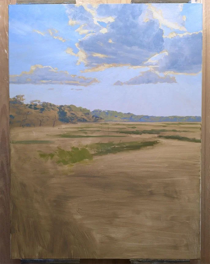

“Colors of Summer” 48x36 sold at Anderson Fine Art Gallery, St. Simons Island, Georgia.
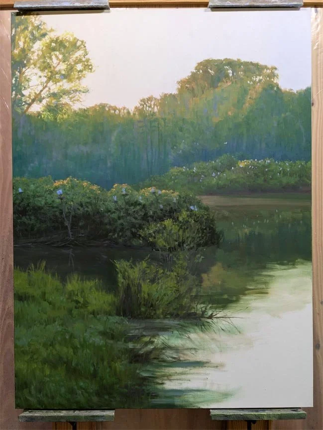
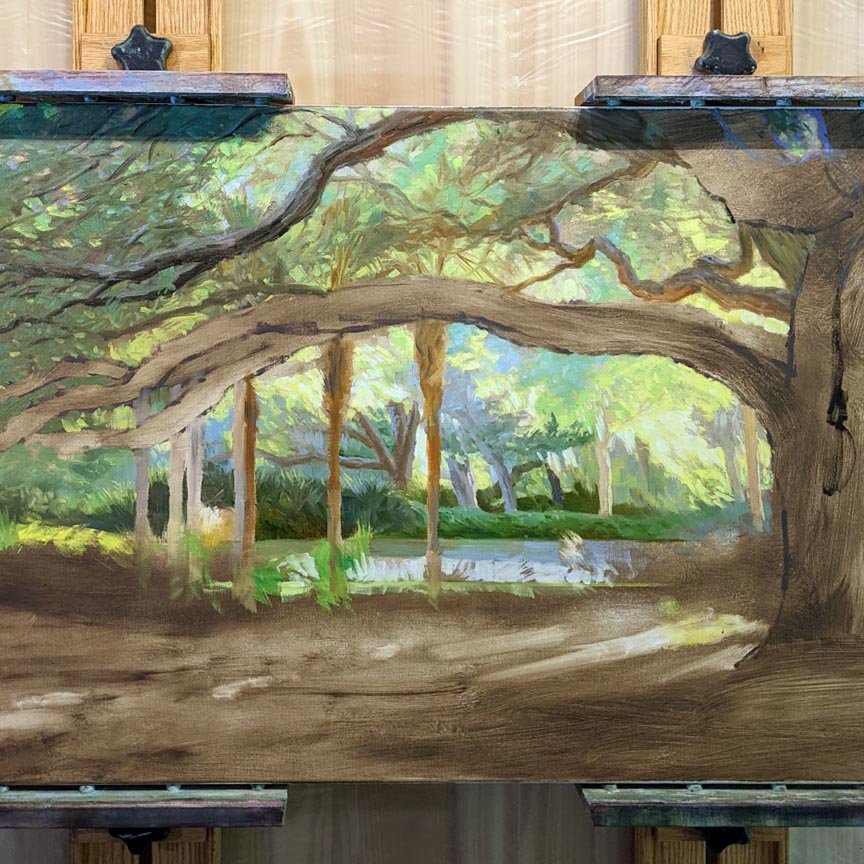
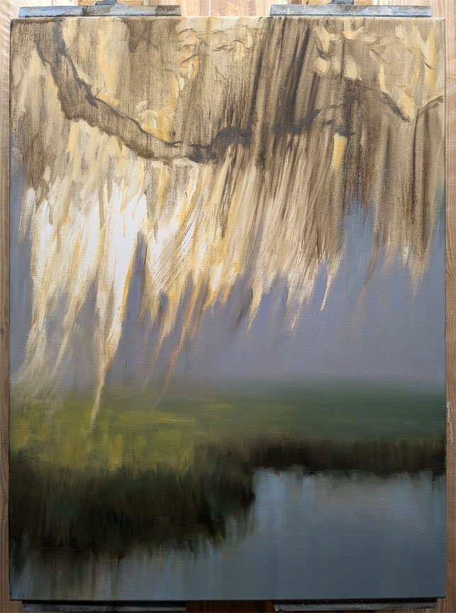
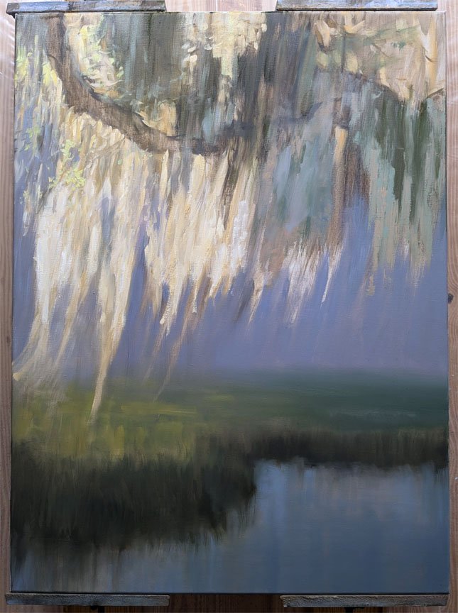
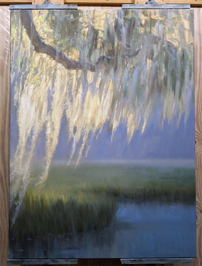
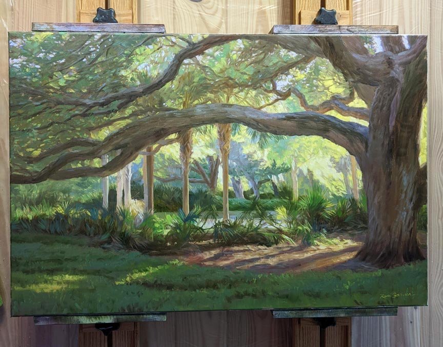
Nesting Ground, 48x36 oil painting while in progress:

The new moon always appears near the setting sun, never opposite
It's a pet peeve of mine: I'm scrolling through Instagram images of landscape paintings and I see that an artist has decided to stick the moon in their painting. Only they do not understand the basic rules about where the moon realistically appears in the sky. Full moons, new moons, moons everywhere!
I was once guilty of this because I didn't know any better. My father gently pointed out to me that the new moon never appears opposite the sun: only above the setting sun.


I also frequently see artists stick a full moon in the same part of the sky as the sun. In reality, the full moon, when low near the horizon, is always opposite the sun. In the examples above, notice that the sun, not pictured, is behind the viewer, shining onto the cloud and rising full moon.
To inject a bit of humor here, I must admit that when it comes to art, anything goes. In my experience, many art-buying customers don't know whether the full moon you've painted is the moon or the sun! But if you wish your otherwise realistic landscape painting to read right, please take a moment to learn a little bit about your moons.
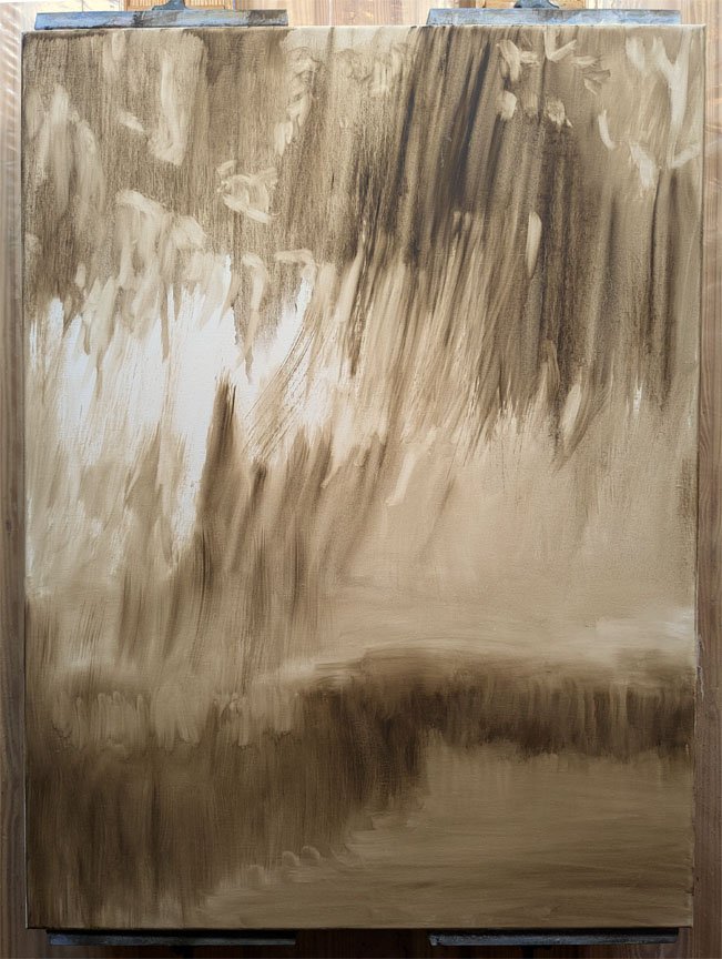
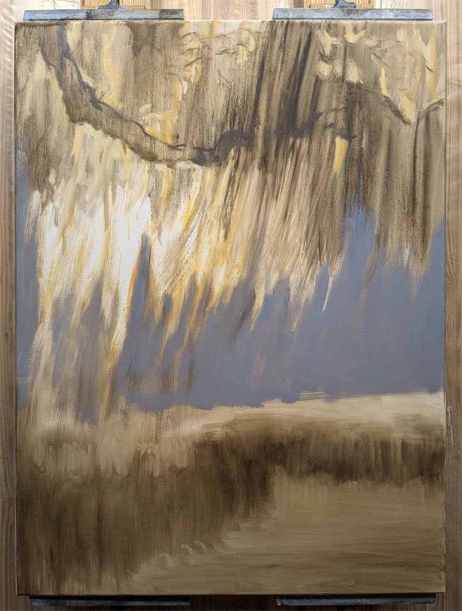
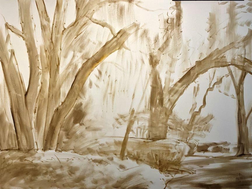
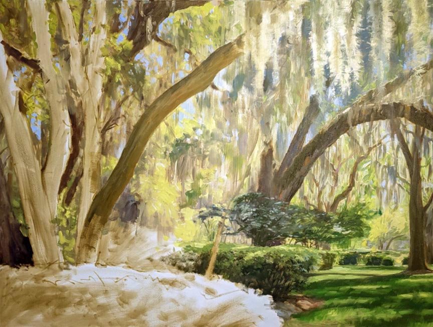
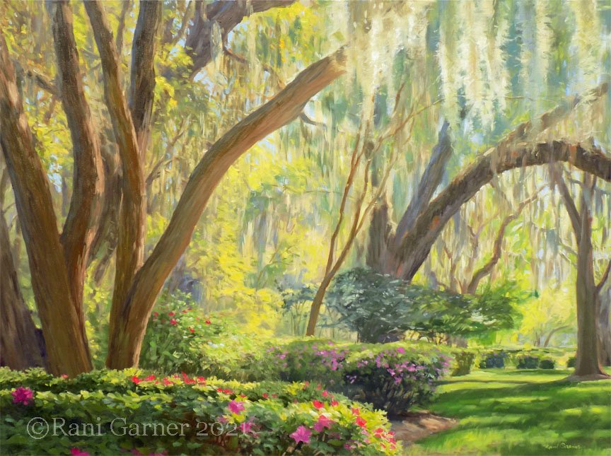
This is a new painting for my show in April at Anderson Fine Art Gallery. Here’s how I painted it in stages. You can see that I get a lot said with that very first stage….


Palmettos? That's very specific, but here's why I'm sharing tips: it's a very difficult subject to paint well. When I moved to the southeastern U.S. and first started painting them, I really wasn't doing them justice. After years of palmettos popping up in my landscape paintings, I've only recently gotten good at painting them, so today I will share with you the skills I have learned. If you don't plan on ever painting a palmetto, no worries—these tips apply to most anything with a lot of detail.
In your underpainting, whether you begin with blocked-in areas, a sketchy drawing or more of a toned canvas, give yourself some indication of the location of the main palmetto shapes. At this stage it's best to capture the gesture of the individual frond and its overall shape and size rather than its pointed leaf tips, which can come later. Think a loosely drawn oval with a few lines indicating the direction of growth. Even locating just a few of the main palmettos you see in a big cluster of them will help you find your way around in later stages.
Next, block in some of the darker values and mix a background color that will recede behind your palmettos. Sometimes an olivey green works well here, and I have also found that violet hues are a nice balance with the greens of the palmettos.
At this point, I let these underlying stages dry before proceeding, but it's not necessary. A nice thing about working wet-on-wet is that the brushes glide over the canvas rather than dragging, which yields broken lines. If your underpainting IS dry, you can still work wet-on-wet with a wash of solvent or by oiling out (brushing on linseed oil and wiping the excess off with a rag).
My very best tip for success in painting palmettos: BREAK OUT A BRAND NEW BRUSH! I order a lot of brushes at a time and keep a stash in a drawer. My favorite are Rosemary short flat ivory bristle brushes. I have better results with brushes than with the wide variety of painting knives I have tried. I can't seem to control the amount of paint I'm applying with a knife.
Pre-mix a variety of the greens you will be using in your palmettos. I mix a warm green in about three values, a cool green also in several values, a dark and some grayish blue-green for reflected light, but of course this depends on the lighting in your scene.
Assuming your painting is well underway and it is ready for details, take this new brush, load a small amount of a color on the end and dot where the tip of a palmetto frond ends. Repeat for its neighbors. Also paint a dot at the base of the frond, which is often a burnt sienna color. Then load a brush, start at this base and decisively paint a line to the tip of each frond.
This kind of careful placement is only necessary with the primary palmettos in your painting. For a mass of them, it looks best if you are NOT careful, but keep a light touch and think “sketchy” while painting the palmettos quickly. Wipe off what you're not happy with, and go back to add more detail if needed. I'm never happy when something I've painted looks too labored and careful. The energy of your brushstroke will make it right.
Try to ENJOY this process because it will show in your work if you do! I wish you success.
Comment below if you have questions and please share your own suggestions.
“Romance” is another 36x36 oil painting that looks good under the lights in my studio, but just died on the wall of my living room. So I took the opportunity to rework it, though it has taken me a few months to make up my mind exactly how I wanted to change it. Here it is in stages:
I liked it on my easel under bright light. I liked the way the photograph looked on my website. But when it was hanging out on my living room wall waiting to ship out, it looked so dull and drab that I decided to repaint it. It can be fun to paint over an existing painting because of unexpected things happening, but it’s also challenging because the entire process is one big AWKWARD stage until it’s done. Thought I’d share the photos I took during the rework of Harmony, a 36x36 oil painting:


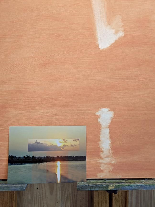
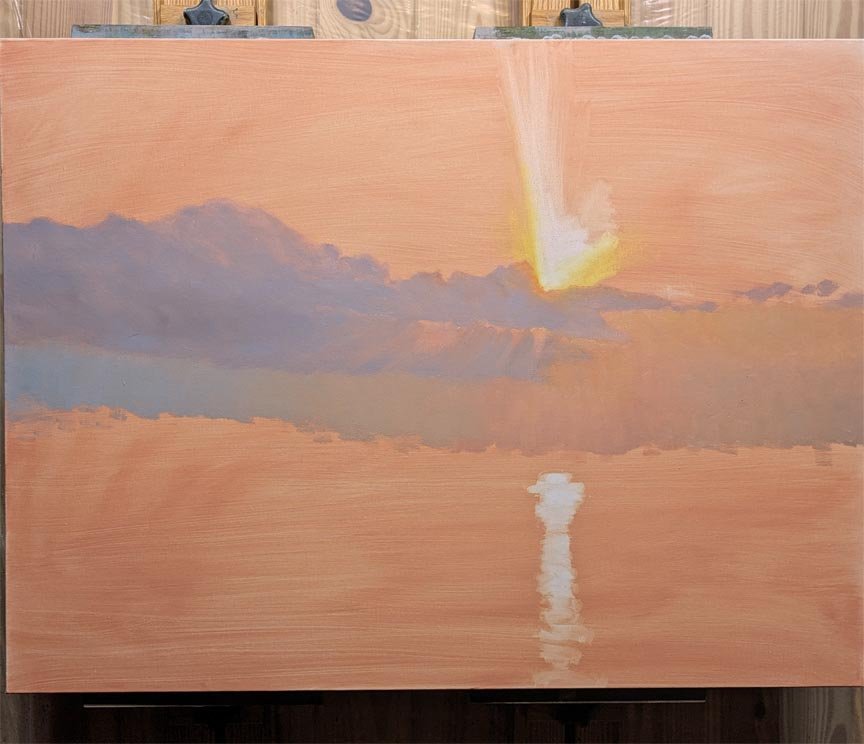
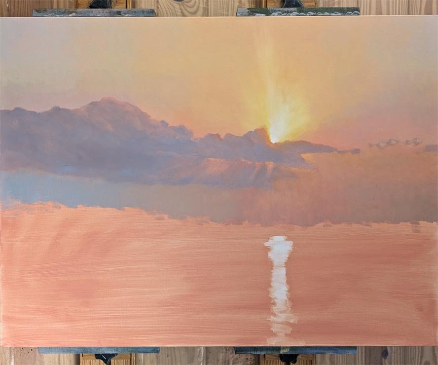
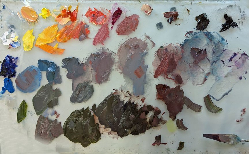
Remember when smoke from the Canadian wildfires came all the way down to the Florida panhandle in July? I was at the beach then and it made for some colorful skies. I have Photoshopped some clouds into a photo I took at the time and will amp up the color shifts for this painting. What I loved about the scene is the intense light reflection in the water. The painting in progress is 30”x40” in oils. The photo of my palette shows how I arranged my gray mixes in the same order as they would be painted on the canvas, just to keep me from getting lost.

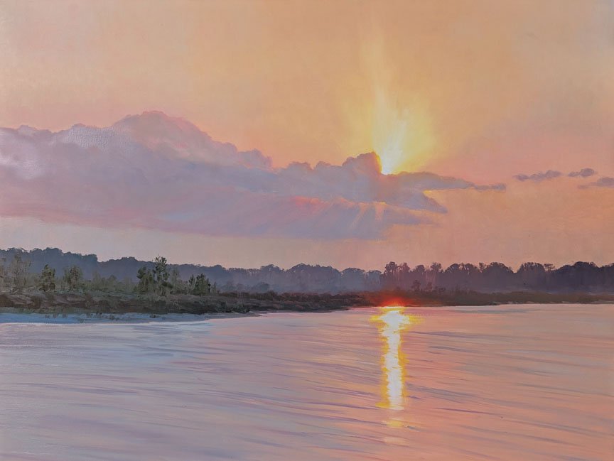

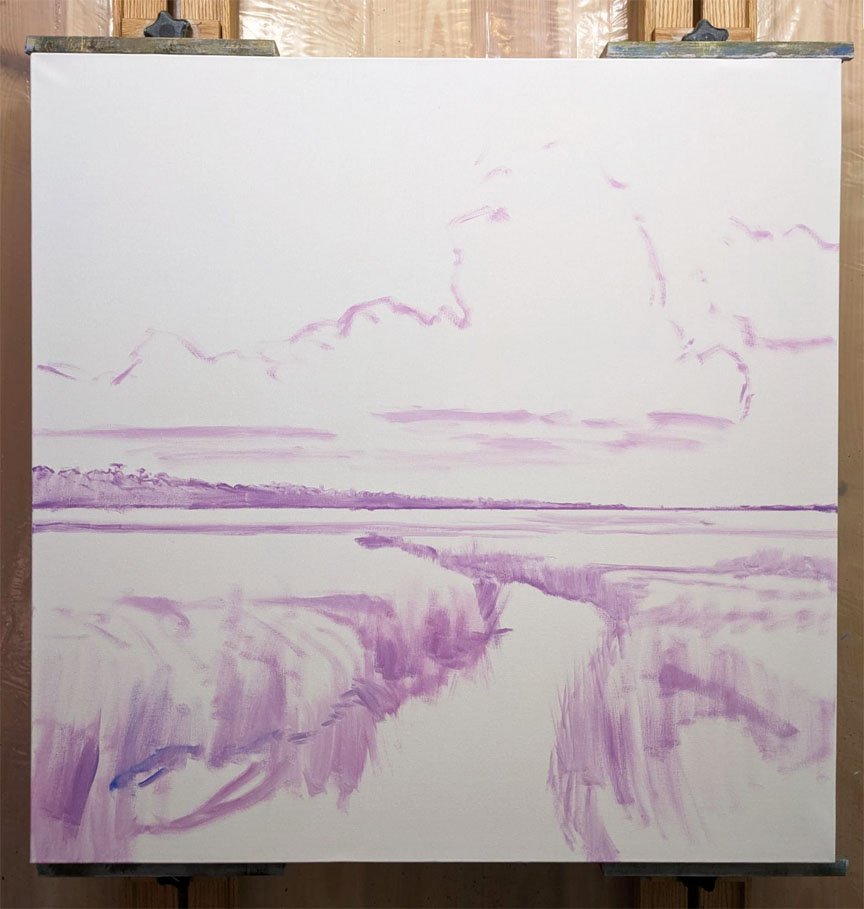
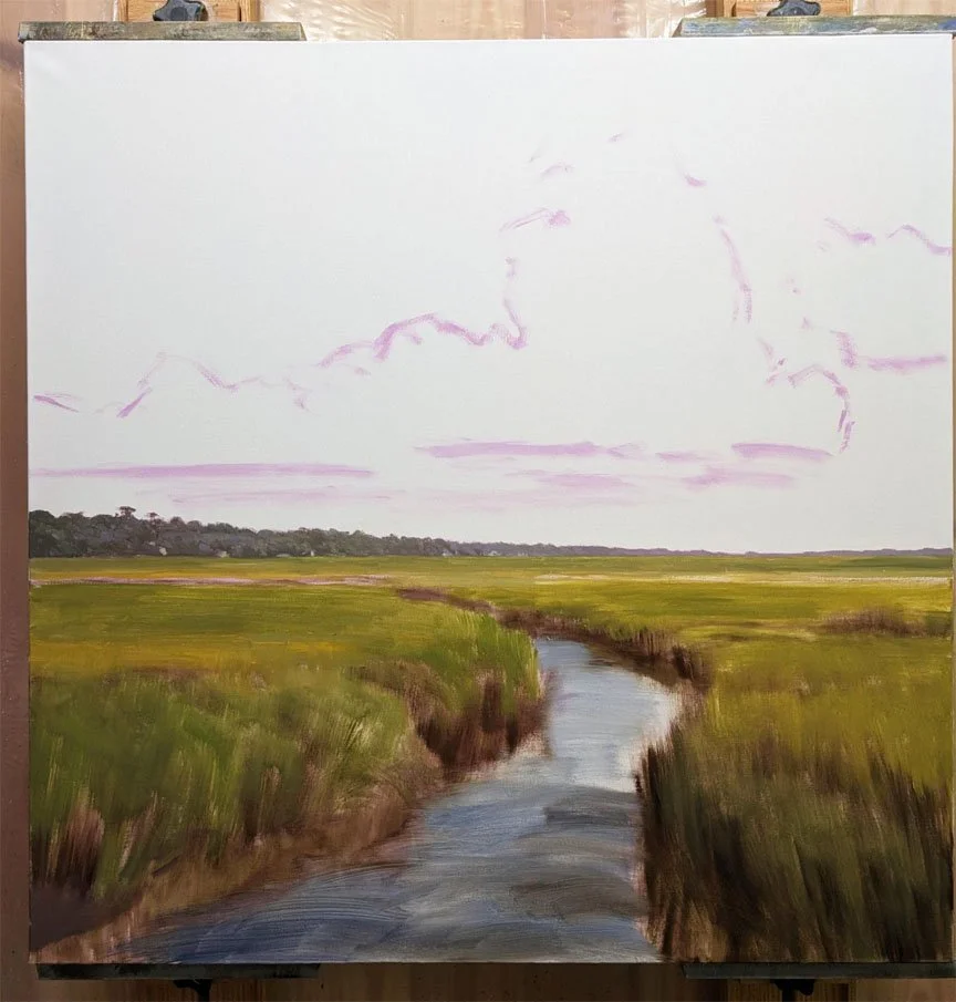
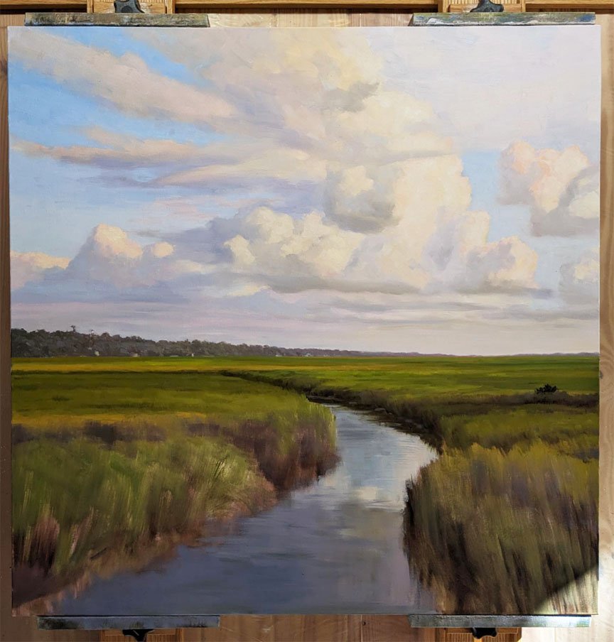
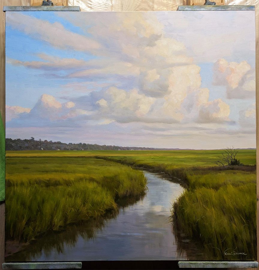
Here is my latest marsh painting while it was in progress:


Clouds Go Floating By, 30x40 oil painting by Rani Garner
I recently posted a few Instagram reels of this painting in progress that sparked a lot of interest. I thought you might like to see how I arrived at this composition.
Since most of my landscapes aren’t the scenes where I live, I make the most of my travel time by planning ahead to be at the right location at the right time of day with my camera. Often, there just aren’t any clouds around to make for an interesting sky. I frequently match my landscape, seascape, marshes and trees with my photographs of skies and clouds taken elsewhere. [NOTE: it’s important if you do this to pay attention to the direction of the light and time of day.]
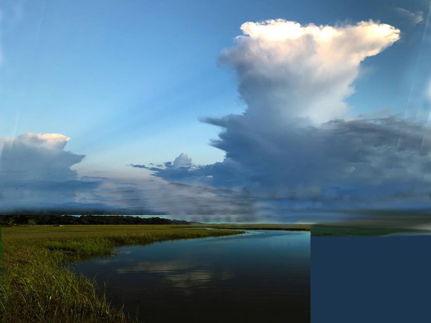
Below are the reference photos I used to arrive at my new painting, Clouds Go Floating By:
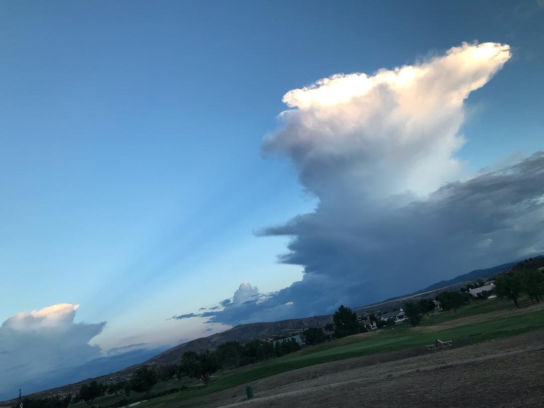
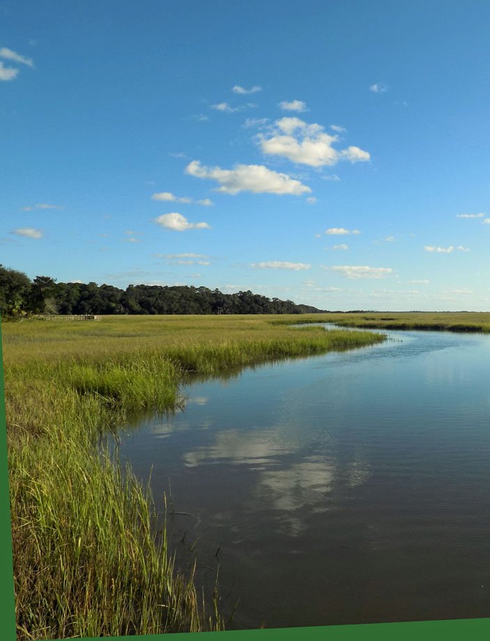
My twin sister sent me the first photo that she took from her home in Prescott, Arizona. I loved the different blues and the way the cloud on the right was casting a shadow on the further cloud. This was the starting point, and then I started thinking about what kind of landscape to match it with. I decided on second photo, which I took at Cannon’s Point Preserve on Saint Simons Island, Georgia.
Using Photoshop Elements, I placed the cropped and adjusted marsh into the sky photo. This was the reference photo I used in my painting. If I make another version, it will definitely be titled, “Fly Me to the Moon."
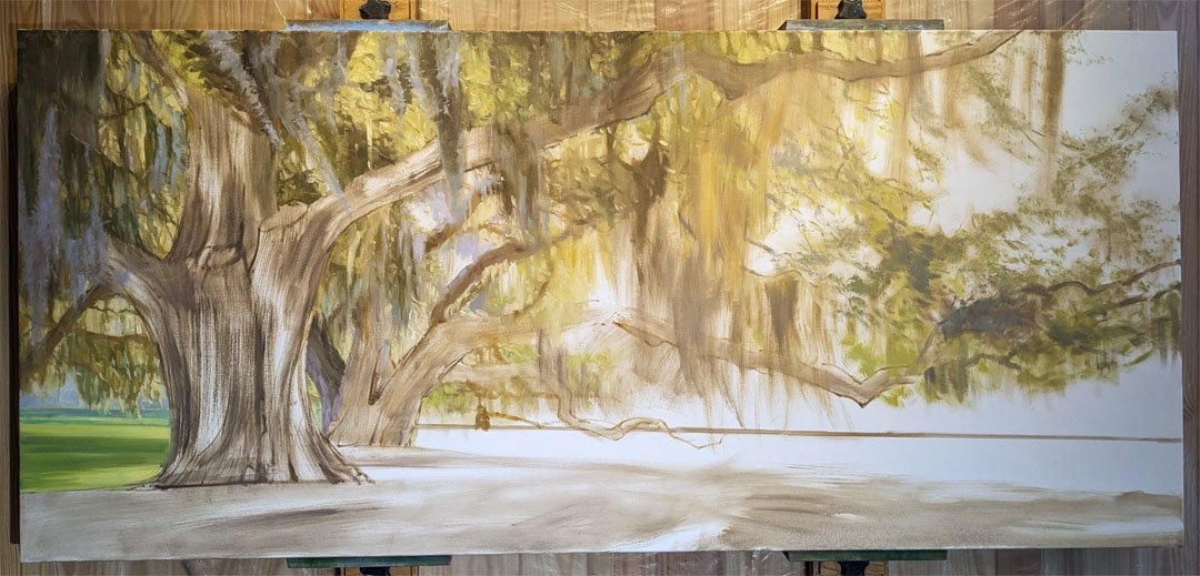
My 36x80 (!!) commissioned oil painting is close to finished. Here are some of the stages from the past few weeks:

Afternoon Oaks, a 36x48 oil painting at Hillary Whitaker Gallery
Today I'm in the studio getting started on a VERY large, commissioned painting for a health care facility. It's on a custom-stretched 36x80 canvas that I primed yesterday. So how do I start such a big piece?
Well, since the subject is a row of gnarly live oak trees in all their mossy glory, I've decided to forego my usual toning-the-canvas-and-wiping technique to create the placement. I'm starting by drawing the trees onto the white canvas, and boy am I enjoying it! It's just like all the figure drawing I did when I was in college—these trees even remind me of people with their reaching arms. And just as with drawing the figure, getting the gesture of the tree is what I want to capture. They make graceful shapes but also have great strength in their lines and upward thrust, so making strong, powerful, confident lines is going to best capture them in my painting.

This painting is based on a new, existing painting at Hillary Whitaker Gallery in Ponte Vedra Beach, FL—a 36x48 called Afternoon Oaks. Keep a lookout for updates on this project!
Artists, this one’s for you
Read Morestages of a painting
Read MoreMy latest landscape while in progress. Spring Brilliance, 24x36 at Anderson Fine Art Gallery
On January 1st, I moved in to my brand new studio. My husband designed an addition off our kitchen onto what was a section of the deck. It features high ceilings, with more upper windows yet to come, and a below-the-floor storage room with a trap door and stairway down.
Here are some photos of various areas, and for any artists reading this, I’ve shared a few tips about my setup. I’ll also mention any products I’d like to recommend if you’re interested in finding them (no, I’m not being paid).
So, welcome to my studio….

art studio of Rani Garner, Marion County Georgia USA

my Tueller wall easel, great for large works. The two masts slide on the horizontal rails to adjust.

I get paint all over walls, floors and windows so have tried to protect them

This is a rolling taboret with lots of drawers. I don’t like the idea of having to hang up paint tubes in an exact location on the wall, even though it looks pretty in other artists’ studios…I just want to find it fast, squeeze out what I need and throw it back in the drawer! The brands of oil paint I use are mostly Gamblin, some Windsor Newton, and Permailba white for mixing. I love Rosemary Brushes in short brights of all sizes. I use recycled yogurt cups for small amounts of medium. I bought the cans of paint by mistake—I don’t recommend! Messy and a lot of it dried up.

This is my other work easel (I keep lots of paintings going simultaneously). The room divider acts as a paint spatter shield. I would rather have a larger work surface for palette and brushes, but the beauty of this setup is that the palette on the taboret is still on the correct side for a right-handed person. I once saw an artist who used a lazy susan revolving palette, and that’s what I need here!

A cozy corner for sunrise coffee, book breaks, and kitty visits. There is still plastic on the outside of the windows because of continuing exterior painting.

This might not interest most people, but here is where I store framing hardware, tools and solvents. The middle section has doors that close. My speakers for streaming Spotify are on the top.
stages of an oil landscape painting: Quiet Garden, 30x40. This is a garden full of blooming azaleas at Christchurch on Saint Simons Island, Georgia.


In a New Light, 30x30 oil painting by Rani Garner
I've been meaning to show you this painting. “In a New Light” is one of my new 30x30 oil paintings for a solo show at Anderson Gallery in October 2021. I thoroughly enjoyed painting it, and it went very well, and the primary reason for this is that I retained control of the color. Consequently, it has good color harmony and didn't take me on the usual roller coaster ride when mixing strong colors for a landscape.
Let me show you how I did this.
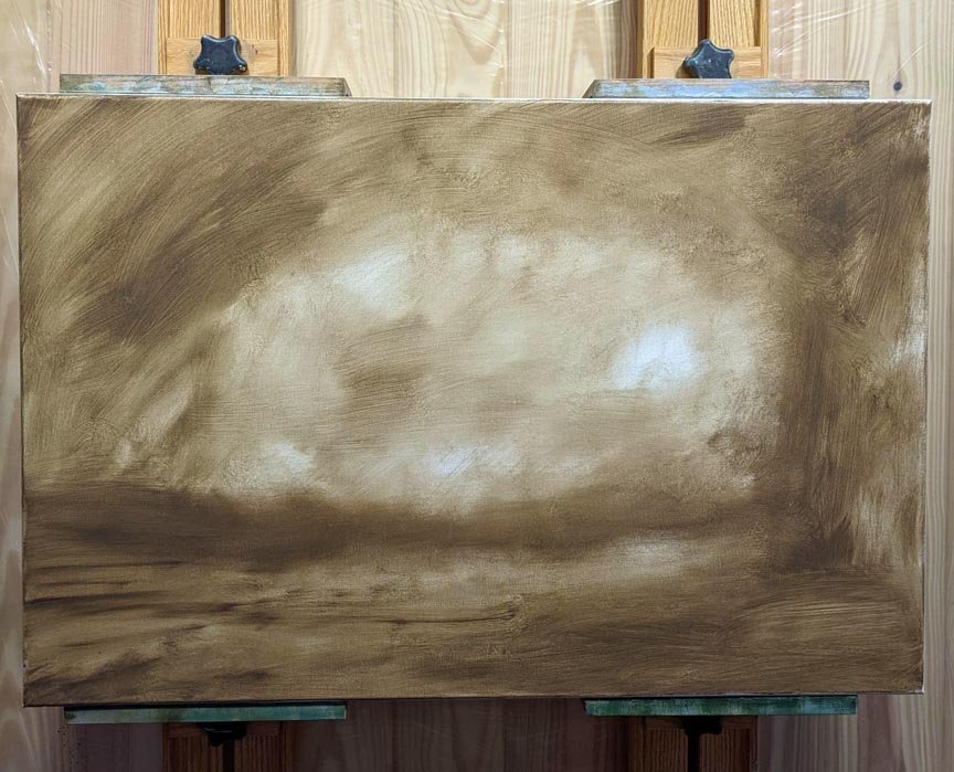
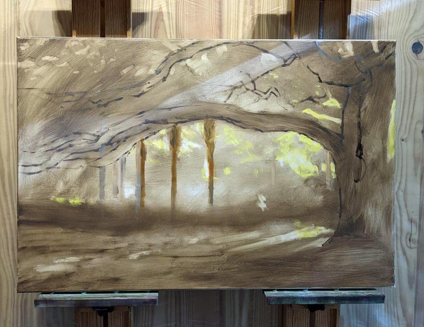
Firstly, there is no one way to paint something, and while sometimes it's liberating to just dive into a painting, working instinctively, it's usually a good idea to start by considering how I am going to paint something. Am I going to mix the colors I see and paint directly, or first establish the values and paint in layers? Or I could do more drawing with the paint and build up the lines and brushstrokes slowly, etc. For this painting, my reference photo was nothing special. I liked the early morning light and gold-rimmed clouds, but the color was blah—colorless darks--and there was no focal point. Seeing that the sun was to the left, with the landscape growing increasingly cooler to the right side, I decided I would mix four main colors. I mixed a warm green (based on Sap Green), a cool green (based on Phthalo Green), a warm red (based on Burnt Sienna) and a cool red (based on Quinacridone Magenta). I did do an underpainting first using Burnt Sienna to establish the placement of the landscape's elements.

burnt sienna underpainting before painting the marsh grass
Then I mixed each of these colors into its neighbors, as you can see here:

The warm reds were for the left side, closer to the rising sun, and the warm greens were towards the right. The cool red was for the left sky, moving towards the cool green on the right side of the sky.
Why? Because after years of painting water, I have discovered that when you mix magenta with Phthalo Green, a kind of blue is created, because they are both cool colors. HUH? Red + green = BLUE??? Give it a try and you will see for yourself. This is a very useful mix for painting seascapes, and I was really happy that it worked for the sky in this painting.
I paint every day, and I have to confess that most of the time I mix colors as needed. By the middle of the day, my palette is pretty filled up with not much organization. There are a dozen brushes in use with lots of wiping and cleaning to use one for the next color. By controlling and limiting the palette for a painting, I not only achieve better color harmony; I also waste less paint, brush cleaner, palette space and then have fewer brushes to clean at the end of the day's work. You can try this for yourself and discover interesting color mixtures you might not have thought of otherwise.
When artists get to the point where they have steady sales, then a new set of challenges arises. How will you keep up with sales? What if you run out of ideas for paintings?
Here are some thoughts I have about being a productive artist.
It starts with finding a subject that inspires you to paint. The most exciting part of the process, for me, is going exploring with my camera. I think of it as a Light Safari, since the light aspect is most important to my work. I have to be in the right place at the right time, which takes some planning. It is so exciting when I find great light and match it with a good subject, and I can't wait to turn all that gold into paintings. Here is how that process works:
Once back home again, I am pretty much painting every day. I am most productive when I have many pieces in various stages, so there is always something I want to work on. This also allows for dry time between stages. Some days, I might not want to tackle a whole bunch of details, and I might feel more like placing the composition. I also take frequent breaks, not to rest my arm so much as to rest my brain! I find it is mentally exhausting to focus my concentration on painting, as it is really hundreds of small decisions:, like “what is that color? No, I need to adjust it: is it more blue or violet? Should I tone it down with gray?” Etc.
In addition to painting every day, I am also constantly working on developing my ideas and photographs into future paintings. I use Photoshop Elements on my desktop computer and have folders for various subjects under the heading “Art Ideas.” After a trip with my camera, I enjoy looking through the photos and noting which raw photos have potential for paintings. The next stage, days later, will be starting to edit the photos, cropping and composing to various canvas proportions, which I save. I know from experience that no matter how excited I am to begin painting, it is best to wait and go back to look at these ideas with fresh eyes. Something that seemed wonderful before might have lost its luster, or I can more clearly decide whether a square composition is better than vertical for a particular subject, etc.
In summary, to maximize productivity:
-I have as many as six or seven paintings going at once, in different stages
-I have many future painting ideas in development
-I have systems in place for storing, finding and editing my reference photos
There are times when I wish I could explore variations on a theme, but I have to balance that with the priority of keeping my galleries supplied with new work. I don't think I will ever run out of things I want to paint, and I hope these tips will inspire other artists to be more productive.