“Colors of Summer” 48x36 sold at Anderson Fine Art Gallery, St. Simons Island, Georgia.


“Colors of Summer” 48x36 sold at Anderson Fine Art Gallery, St. Simons Island, Georgia.
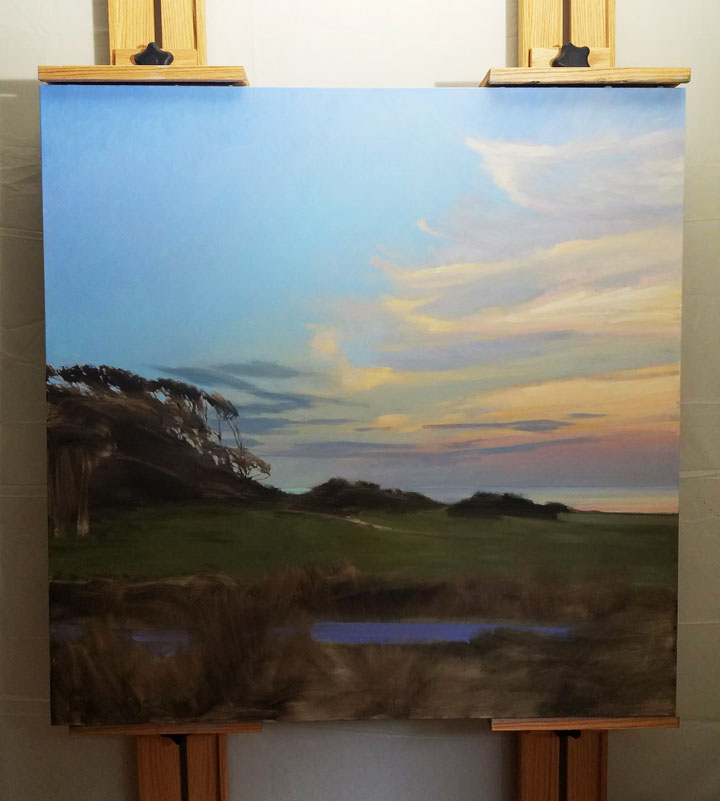
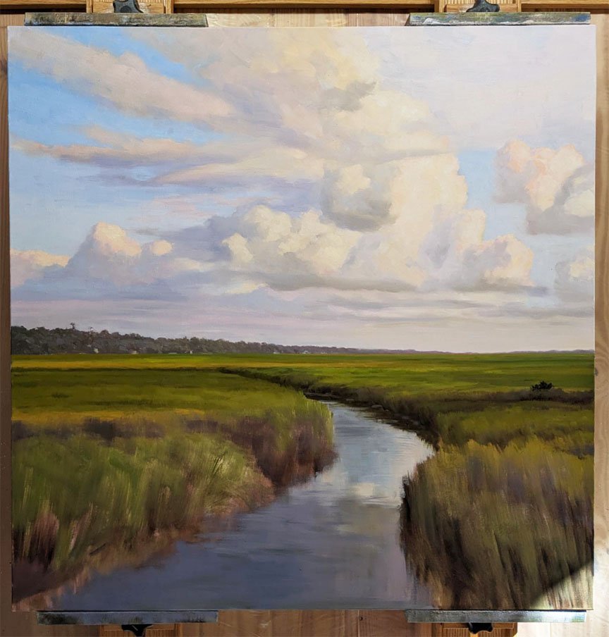
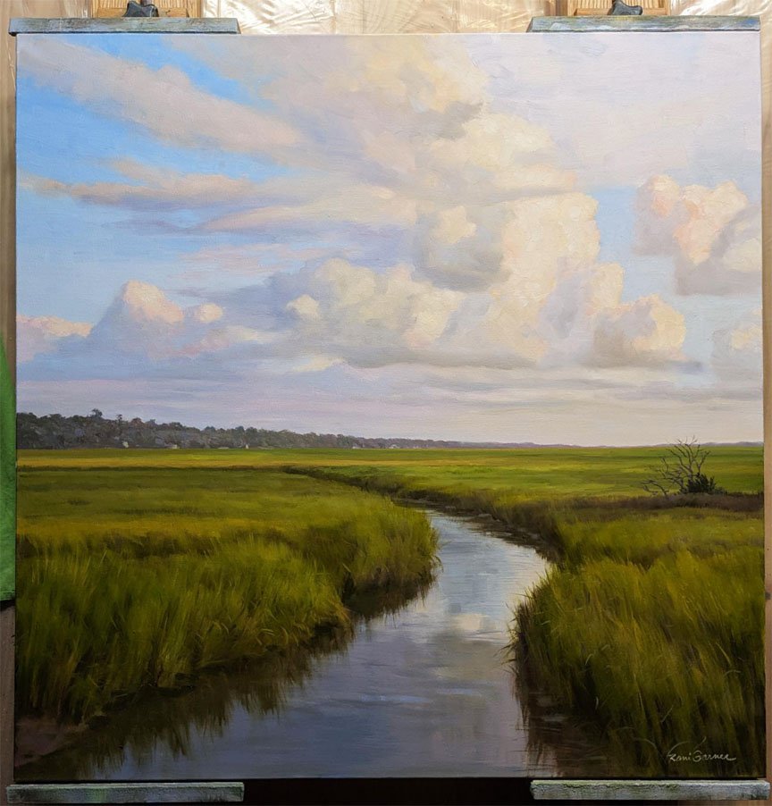
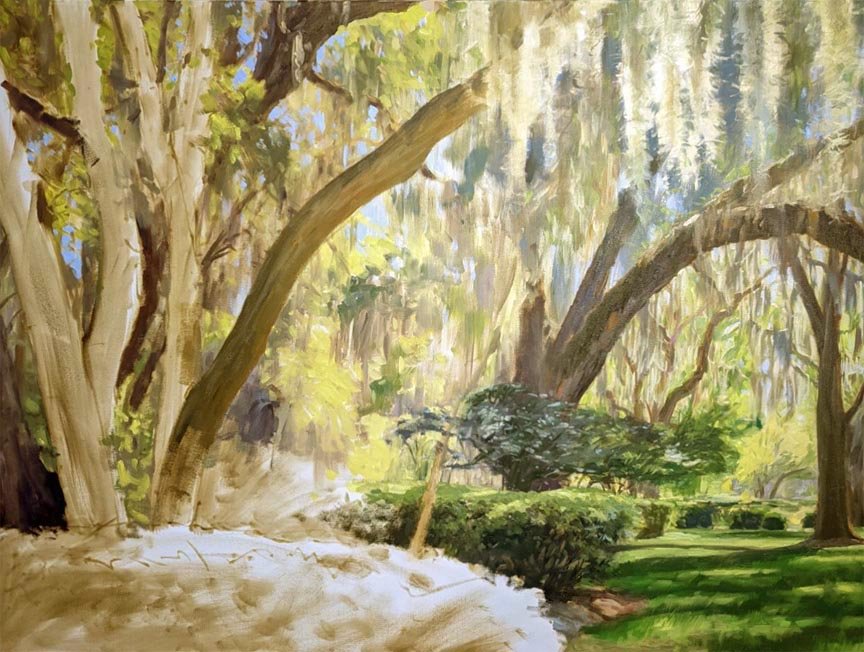
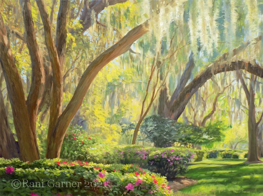
Nesting Ground, 48x36 oil painting while in progress:
This is a new painting for my show in April at Anderson Fine Art Gallery. Here’s how I painted it in stages. You can see that I get a lot said with that very first stage….

I liked it on my easel under bright light. I liked the way the photograph looked on my website. But when it was hanging out on my living room wall waiting to ship out, it looked so dull and drab that I decided to repaint it. It can be fun to paint over an existing painting because of unexpected things happening, but it’s also challenging because the entire process is one big AWKWARD stage until it’s done. Thought I’d share the photos I took during the rework of Harmony, a 36x36 oil painting:


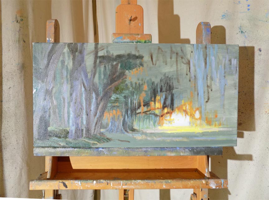
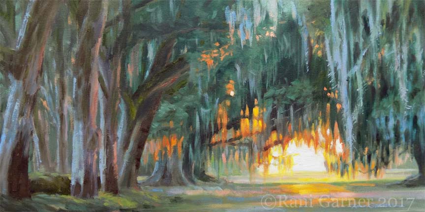
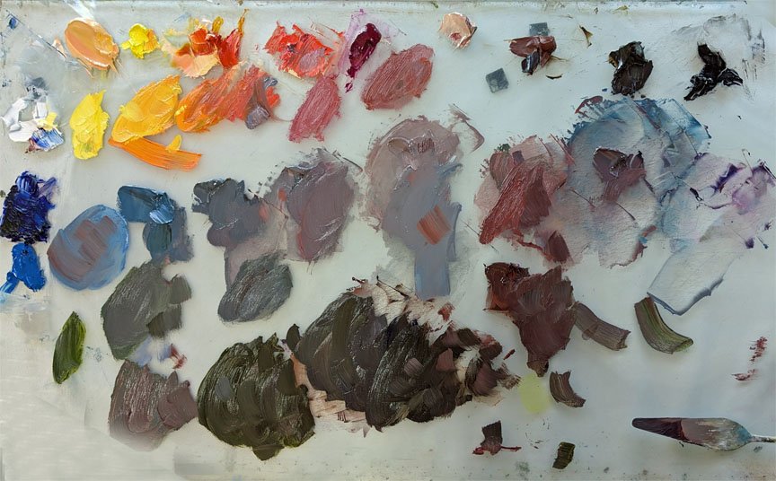
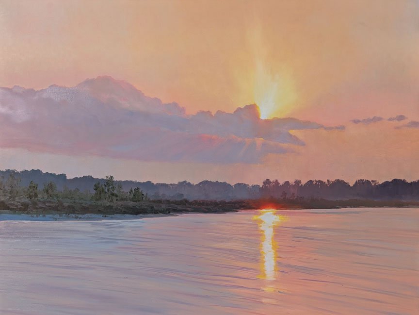
Remember when smoke from the Canadian wildfires came all the way down to the Florida panhandle in July? I was at the beach then and it made for some colorful skies. I have Photoshopped some clouds into a photo I took at the time and will amp up the color shifts for this painting. What I loved about the scene is the intense light reflection in the water. The painting in progress is 30”x40” in oils. The photo of my palette shows how I arranged my gray mixes in the same order as they would be painted on the canvas, just to keep me from getting lost.


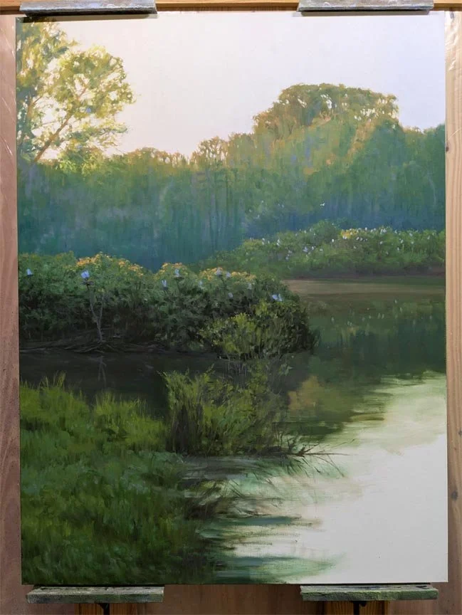
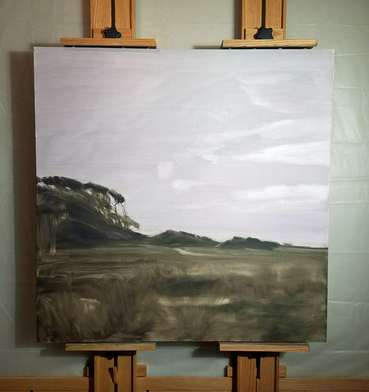
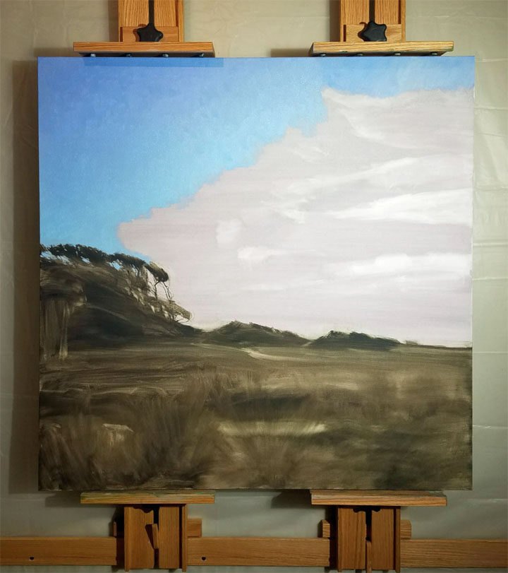
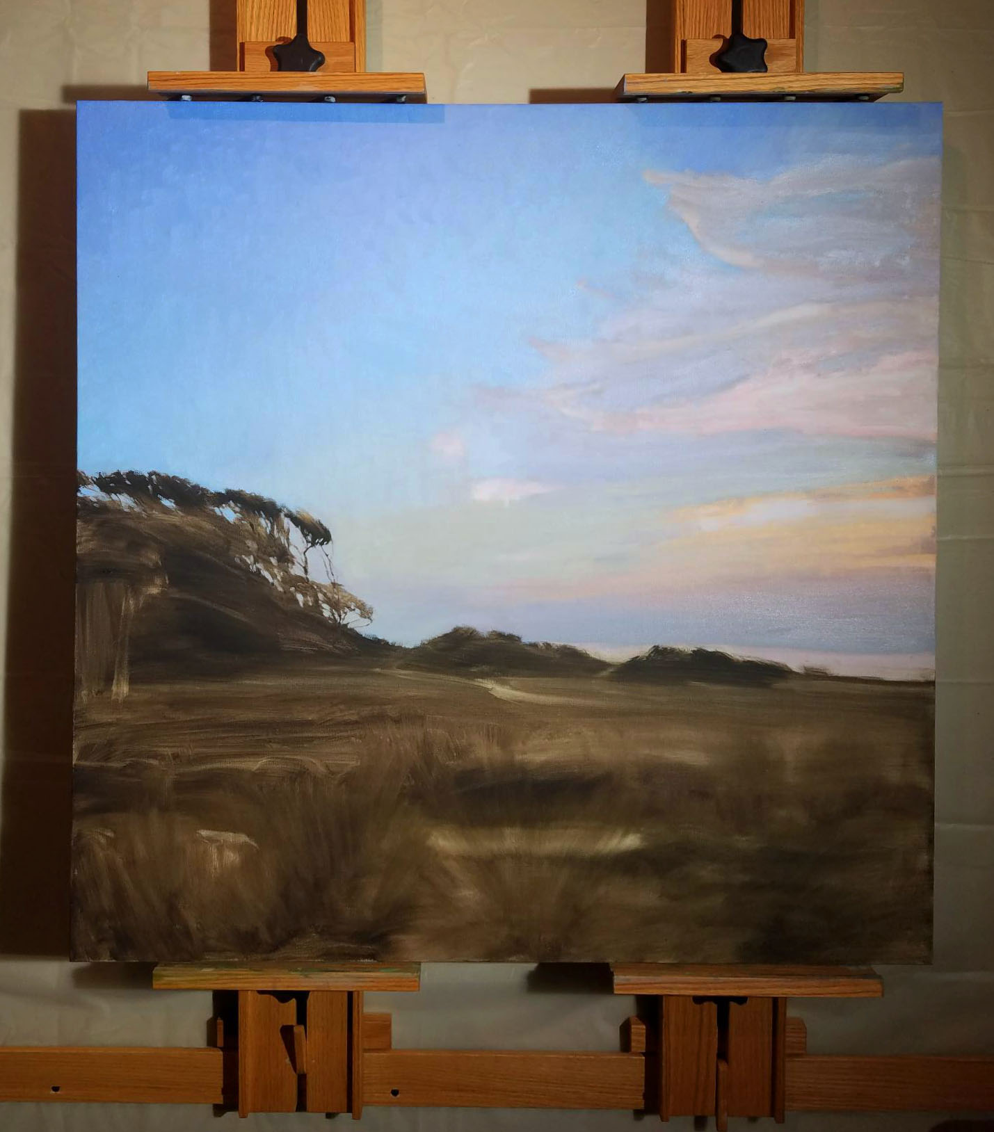
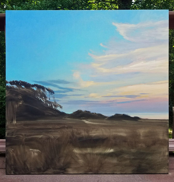
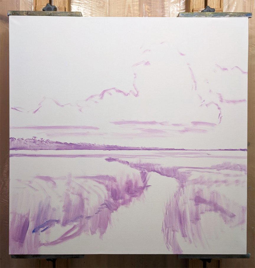
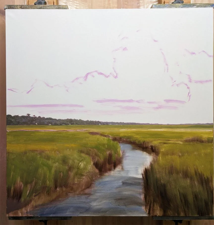
Here is my latest marsh painting while it was in progress:


My 36x80 (!!) commissioned oil painting is close to finished. Here are some of the stages from the past few weeks:

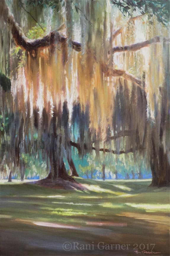
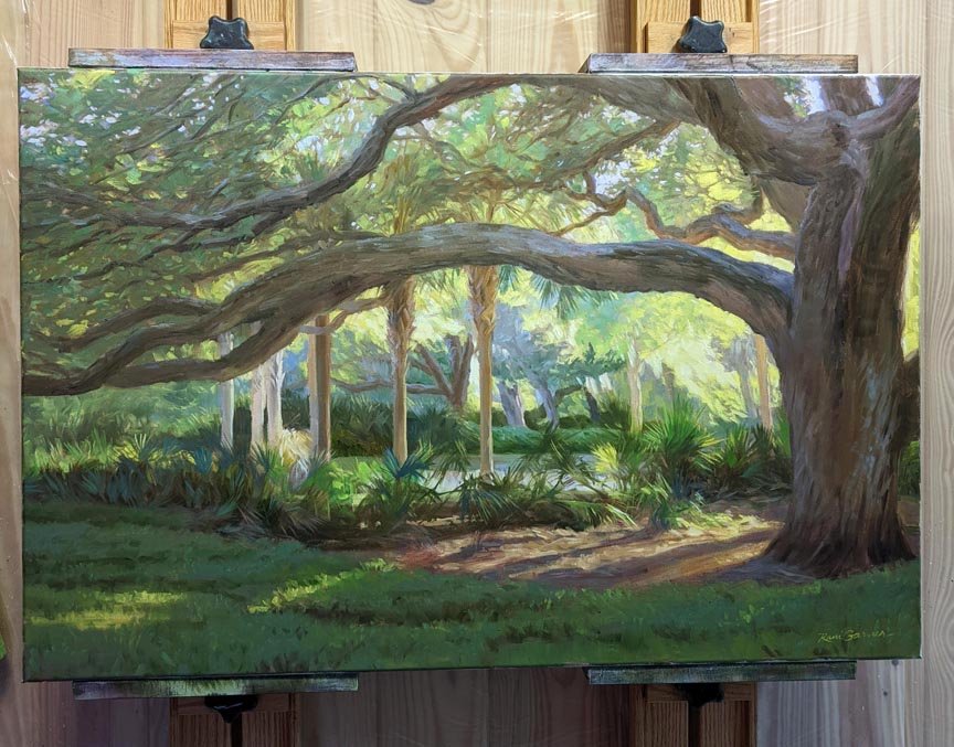
Afternoon Oaks, a 36x48 oil painting at Hillary Whitaker Gallery
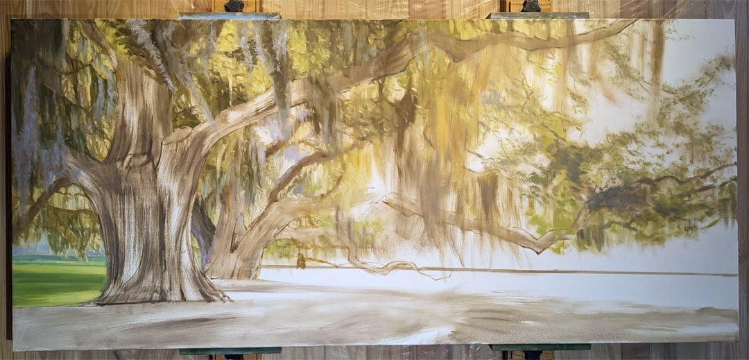
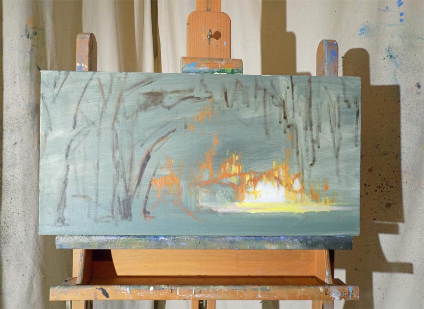
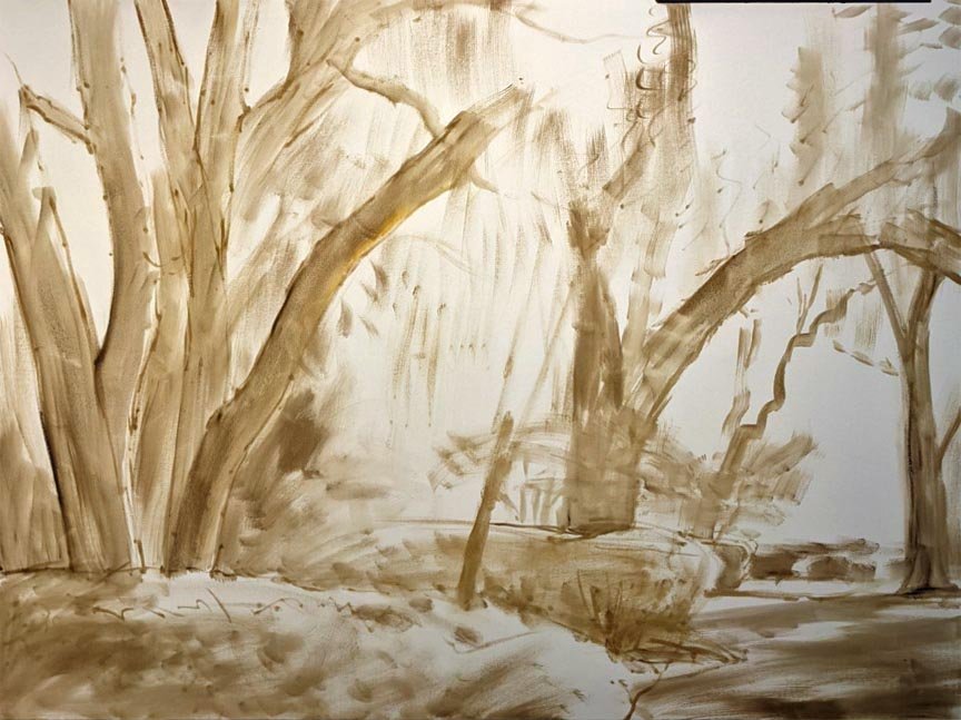
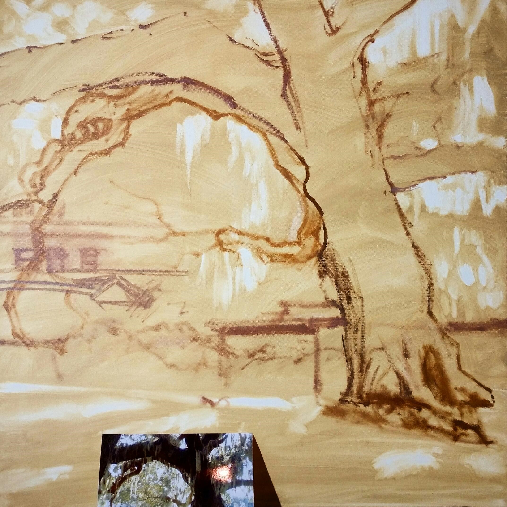
Today I'm in the studio getting started on a VERY large, commissioned painting for a health care facility. It's on a custom-stretched 36x80 canvas that I primed yesterday. So how do I start such a big piece?
Well, since the subject is a row of gnarly live oak trees in all their mossy glory, I've decided to forego my usual toning-the-canvas-and-wiping technique to create the placement. I'm starting by drawing the trees onto the white canvas, and boy am I enjoying it! It's just like all the figure drawing I did when I was in college—these trees even remind me of people with their reaching arms. And just as with drawing the figure, getting the gesture of the tree is what I want to capture. They make graceful shapes but also have great strength in their lines and upward thrust, so making strong, powerful, confident lines is going to best capture them in my painting.

This painting is based on a new, existing painting at Hillary Whitaker Gallery in Ponte Vedra Beach, FL—a 36x48 called Afternoon Oaks. Keep a lookout for updates on this project!
stages of a painting
Read MoreMy latest landscape while in progress. Spring Brilliance, 24x36 at Anderson Fine Art Gallery
stages of an oil landscape painting: Quiet Garden, 30x40. This is a garden full of blooming azaleas at Christchurch on Saint Simons Island, Georgia.


In a New Light, 30x30 oil painting by Rani Garner
I've been meaning to show you this painting. “In a New Light” is one of my new 30x30 oil paintings for a solo show at Anderson Gallery in October 2021. I thoroughly enjoyed painting it, and it went very well, and the primary reason for this is that I retained control of the color. Consequently, it has good color harmony and didn't take me on the usual roller coaster ride when mixing strong colors for a landscape.
Let me show you how I did this.
Firstly, there is no one way to paint something, and while sometimes it's liberating to just dive into a painting, working instinctively, it's usually a good idea to start by considering how I am going to paint something. Am I going to mix the colors I see and paint directly, or first establish the values and paint in layers? Or I could do more drawing with the paint and build up the lines and brushstrokes slowly, etc. For this painting, my reference photo was nothing special. I liked the early morning light and gold-rimmed clouds, but the color was blah—colorless darks--and there was no focal point. Seeing that the sun was to the left, with the landscape growing increasingly cooler to the right side, I decided I would mix four main colors. I mixed a warm green (based on Sap Green), a cool green (based on Phthalo Green), a warm red (based on Burnt Sienna) and a cool red (based on Quinacridone Magenta). I did do an underpainting first using Burnt Sienna to establish the placement of the landscape's elements.

burnt sienna underpainting before painting the marsh grass
Then I mixed each of these colors into its neighbors, as you can see here:

The warm reds were for the left side, closer to the rising sun, and the warm greens were towards the right. The cool red was for the left sky, moving towards the cool green on the right side of the sky.
Why? Because after years of painting water, I have discovered that when you mix magenta with Phthalo Green, a kind of blue is created, because they are both cool colors. HUH? Red + green = BLUE??? Give it a try and you will see for yourself. This is a very useful mix for painting seascapes, and I was really happy that it worked for the sky in this painting.
I paint every day, and I have to confess that most of the time I mix colors as needed. By the middle of the day, my palette is pretty filled up with not much organization. There are a dozen brushes in use with lots of wiping and cleaning to use one for the next color. By controlling and limiting the palette for a painting, I not only achieve better color harmony; I also waste less paint, brush cleaner, palette space and then have fewer brushes to clean at the end of the day's work. You can try this for yourself and discover interesting color mixtures you might not have thought of otherwise.
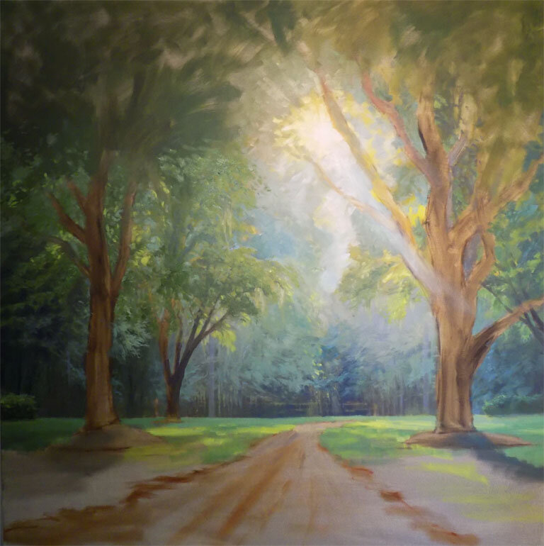
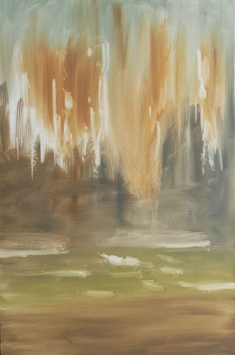
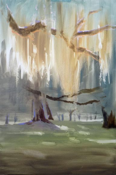
Here are the next two stages of a 55x55 painting in progress. I work from the background forwards, and you can see I’ve been developing the foliage in the upper half. I really want to paint the trees themselves, but they’re in front of a fence that is next to be painted.
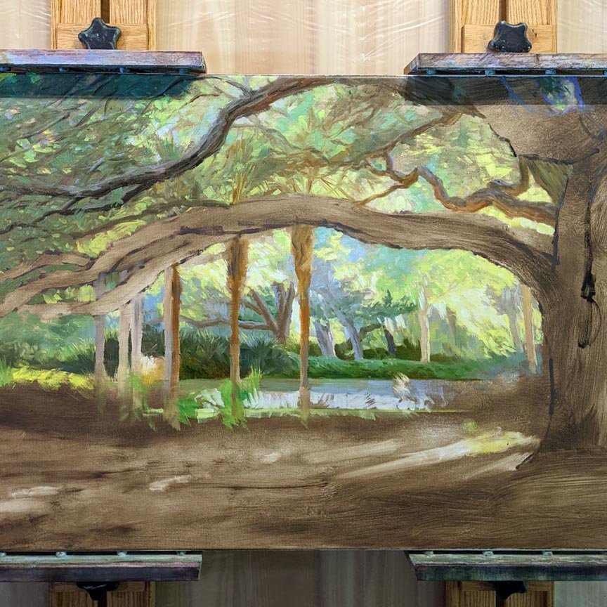
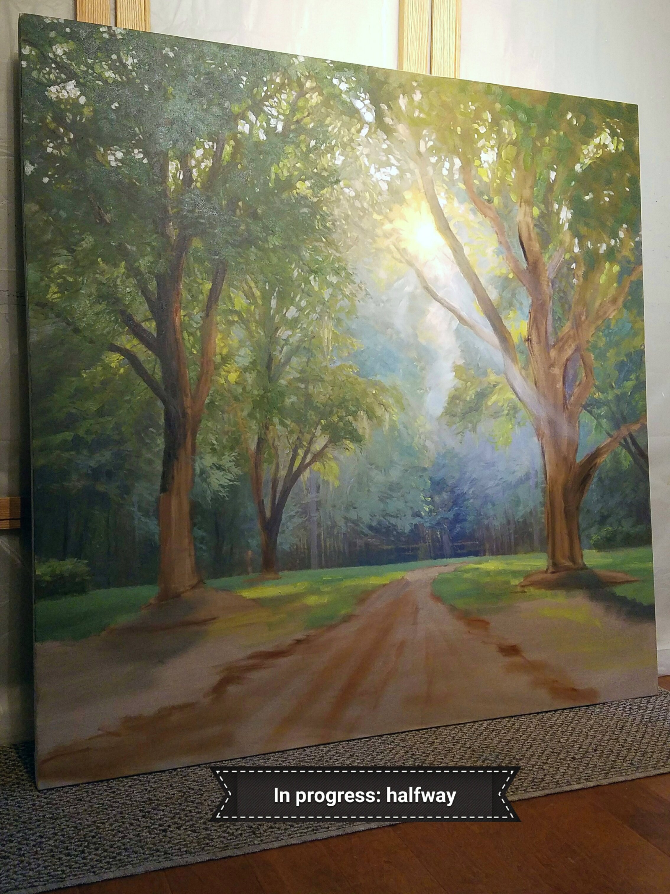
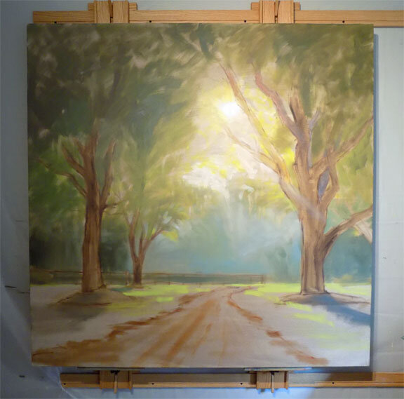
Here is an update on a painting in progress, a gallery commission for a new restaurant being built in South Carolina.
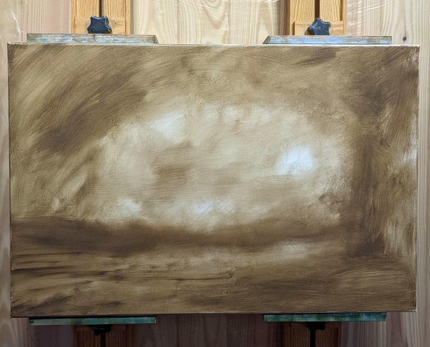
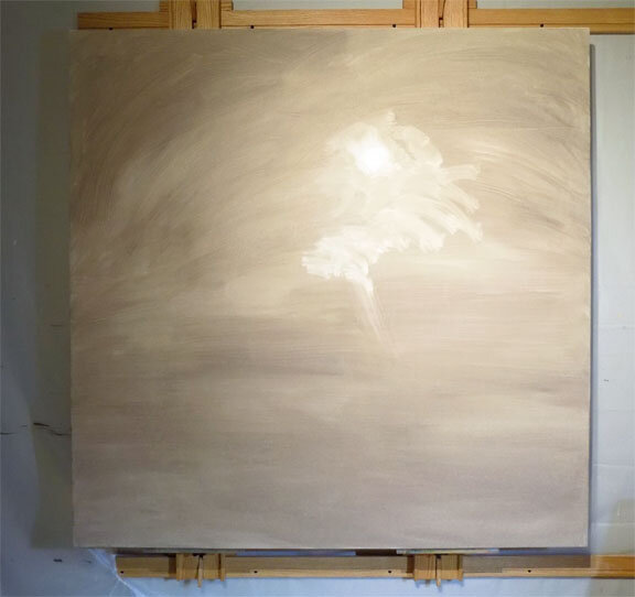
Client to decorator to gallery to artist is the flow of communication, coordinating to work out the details on a project like this. The size for the painting couldn't be decided until more of the wall and window trim work had been installed, but we finally got the decision: it needed to be 55” x 55”. Being a custom size, I had to special order the canvas from a supplier in Houston, TX, who shipped it via freight. Sixteen days later, the canvas was uncrated and placed on my wall easel.
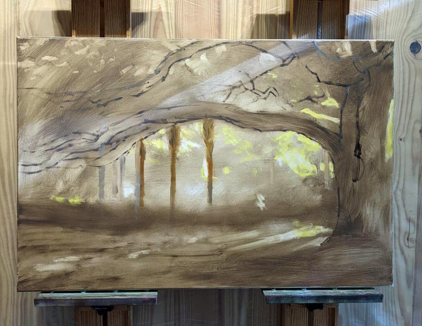
So what's next? How do I begin such a large painting? I am no longer intimidated by a giant-sized blank canvas, and I really love starting large paintings with large paintbrushes and big arm movements. I toned the canvas with my favorite underpainting color: thinned Raw Umber. An underpainting helps me establish some of the future values and gets rid of bright white canvas that might otherwise peek through later stages. While this was wet, I used a small rag to wipe out the lightest light: the sun and its surrounding area (first photo). I allowed it to dry two days. In this way, when drawing/placing the trees, I could wipe off to make changes without disturbing the underpainting.
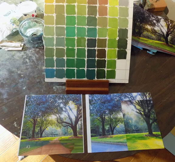
The second step was to examine my reference photos, which I'd already printed out. I got out my color chart of different recipes for green (second photo) and decided which main colors I was going to use: in this case, Phthalo Blue and Yellow Ochre will give me a range of greens from warm to cool. I will also use some Sap Green mixed with Raw Umber for the warmer dark greens and a little Cadmium Lemon Yellow mixed in for the lightest leaves and grass. Tints and shades made from Burnt Sienna mixtures will later create the red dirt road and hints of warm sunbeams streaming through the branches.
If you look at my reference photos, which are not that great, you will see they are heavily Photoshopped. I've added the road and flipped the tree on the right around to give it a better shape! I do stuff like this all time, taking great liberties with what was really there.
The next stage of the painting (third photo) was to “draw” the trees on the canvas with thinned paint. This was mentally tiring, but I enjoyed it. I don't use a projector or grid lines, I just hold up my photo to sight size to place the lines in approximately the right spot on the canvas. Trees have gestures and I took my time getting all the twists and angles drawn, though I left out some of the branches I thought were distracting. Then I drew, with paint, the horizon line, thinly blocked in the trees, a few shadows, and the tree canopy. I also used a straight edge to place fencing in the background. I laid out the road and finished by starting with the background color, one of my blue/ochre mixes. I love how it's looking already! I'll let this dry a few days before starting with the thicker paint.
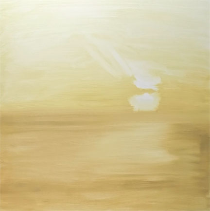
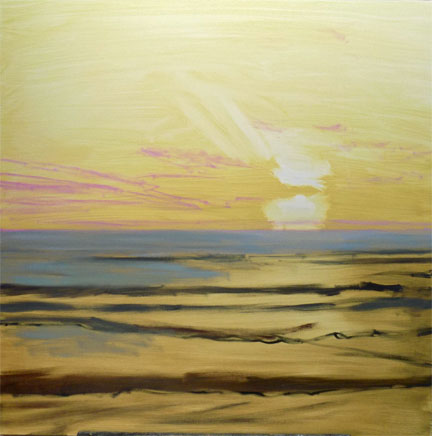
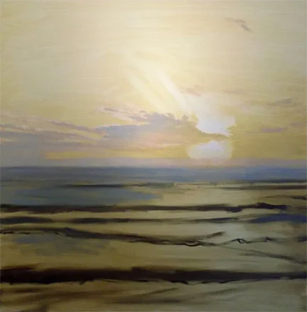
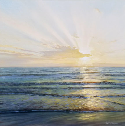
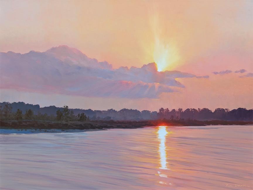
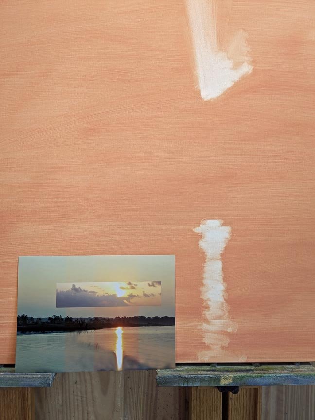
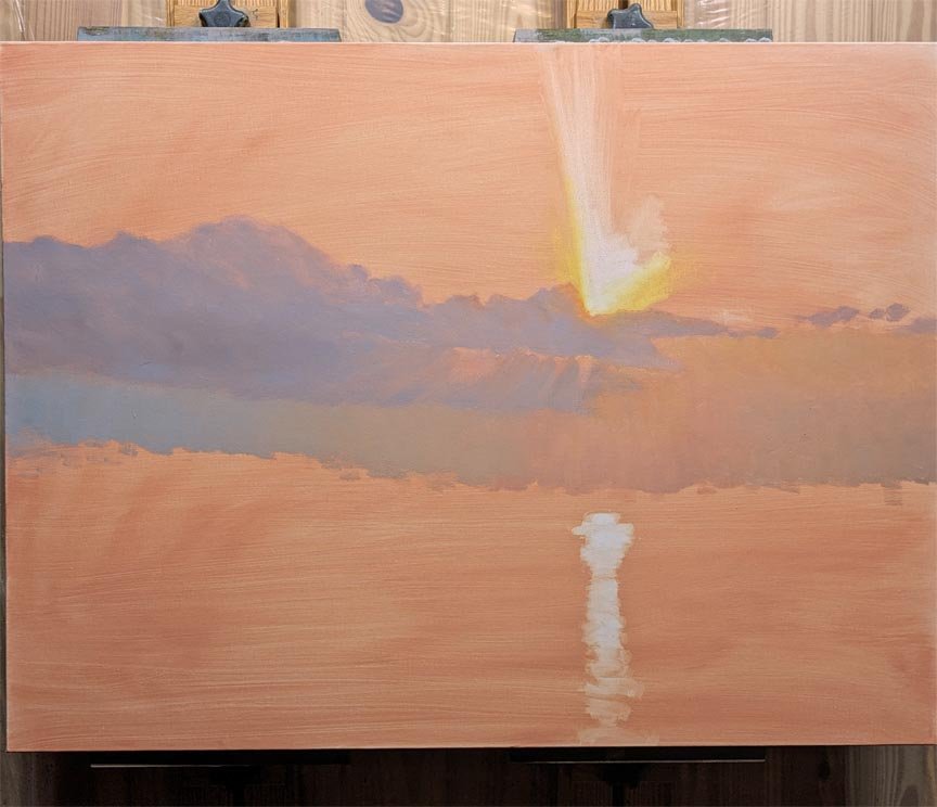
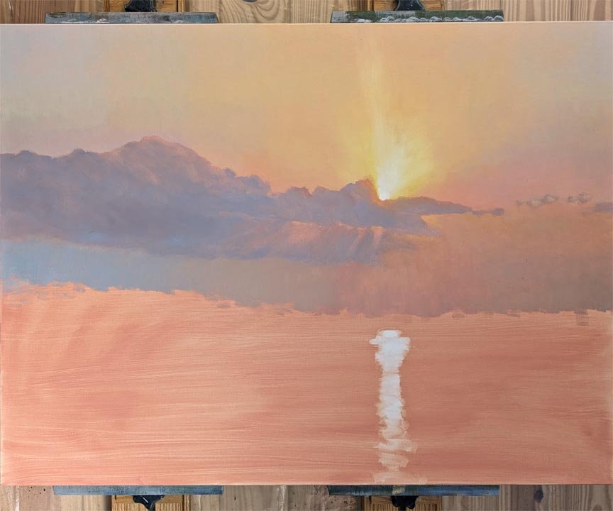
“Corona” is my newest 36x36 oil painting. I used a limited palette: Torrit Grey, Titanium White, Cadmium Yellow Medium, Cerulean Blue and Quinacridone Magenta. This was painted from a photograph I took on Jekyll Island, Georgia, but I added the sun rays. Here it is in various stages so you can see how I work: (click on the right to advance the photos):
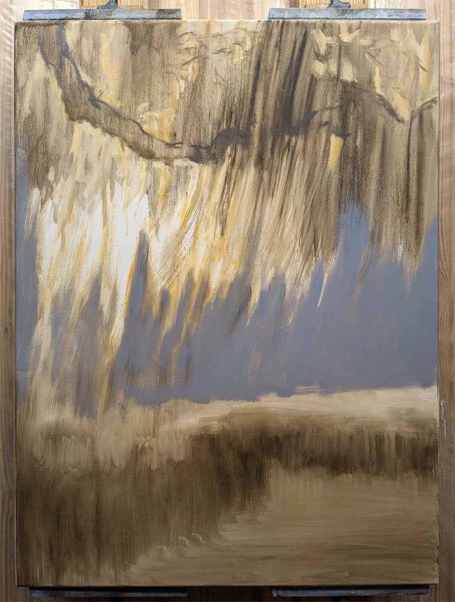
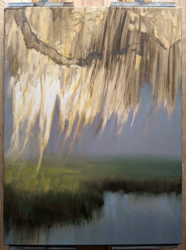
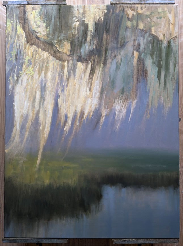
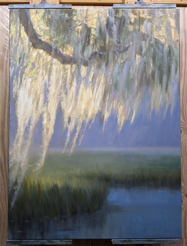
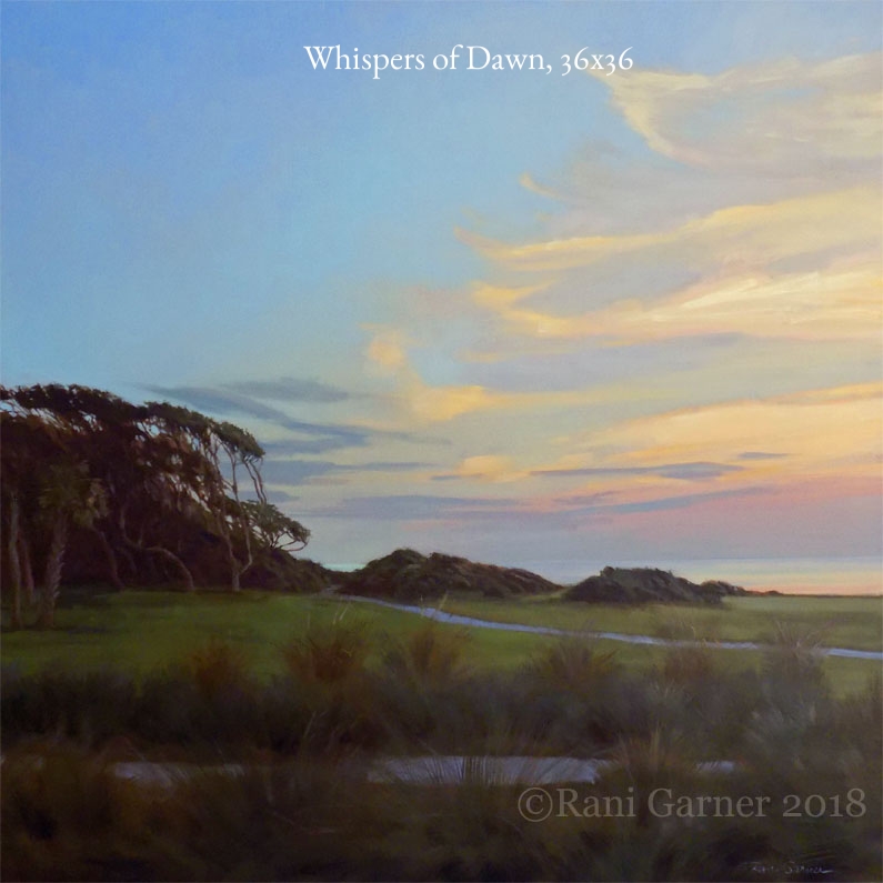
This shows the stages of a new painting in progress. Whispers of Dawn, available soon at Anderson Fine Art Gallery in Saint Simons Island, Georgia. (Click on the right side of the image to advance the slide show.)
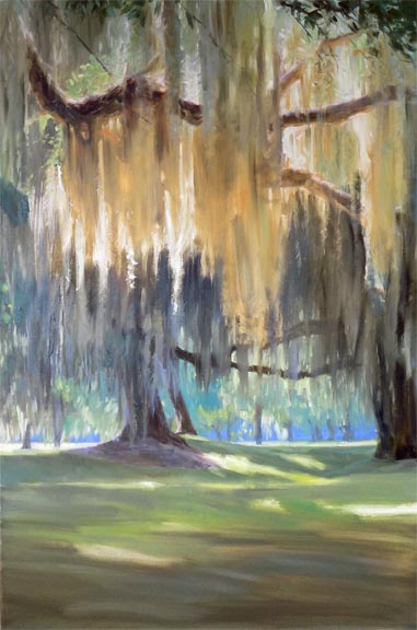
Here are the stages of my 30x30 oil painting King of the Castle. I loved the gesture of this magnificent oak tree alongside the Jekyll Island Club Hotel. Its shape reminded me of a chess piece (hence the title), but it was really all about the light.


Click on the far right to see this painting from start to finish, in stages.


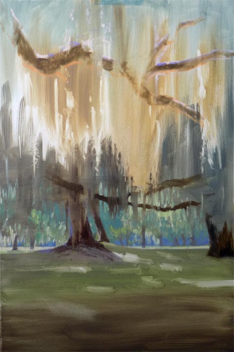
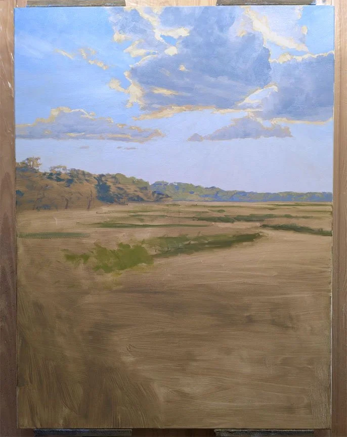
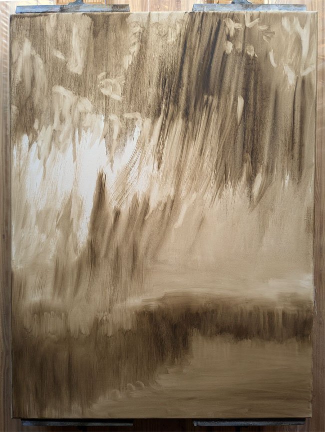
Here are the stages of a typical painting of mine while in progress. My favorite way to begin is to tone the canvas with thinned paint and, using a rag, wipe away the light areas to create the drawing. This also establishes the values and light effect I want right from the start. When dry, I add some lines and dashes of color to get started. I like to work from the background forward, pretty much alla prima.